With over half of the world's mobile money services and the continent's mobile-only nature, Africa has been the ideal breeding ground for the next generation of banking services.
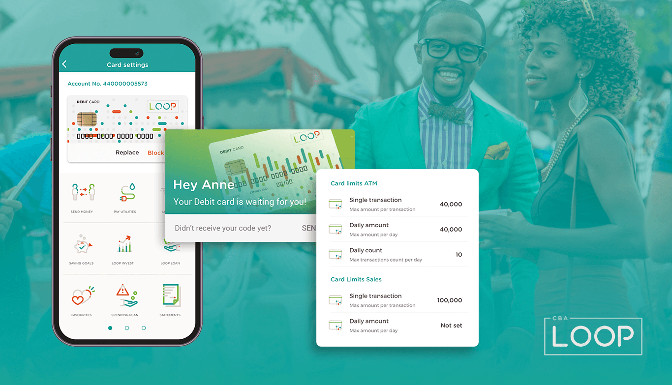
In this spirit and miles ahead of Europe the Commercial Bank of Africa (CBA) launched the CBA Loop App. Loop is a digital banking service that helps customers better manage their money anytime, anywhere. It looks to put financial control back into their hand, quite literally by offering a full banking service delivered through mobile and web experience.
I redesigned the Commercial Bank of Africas Loop app to improve financial accessibility by fixing known user pain points, simplifying onboarding, and enhancing overall usability. Informed by user research I streamlined the experience to help users manage their finances more efficiently and improve the overall usability of the app.
Deliverables
User research
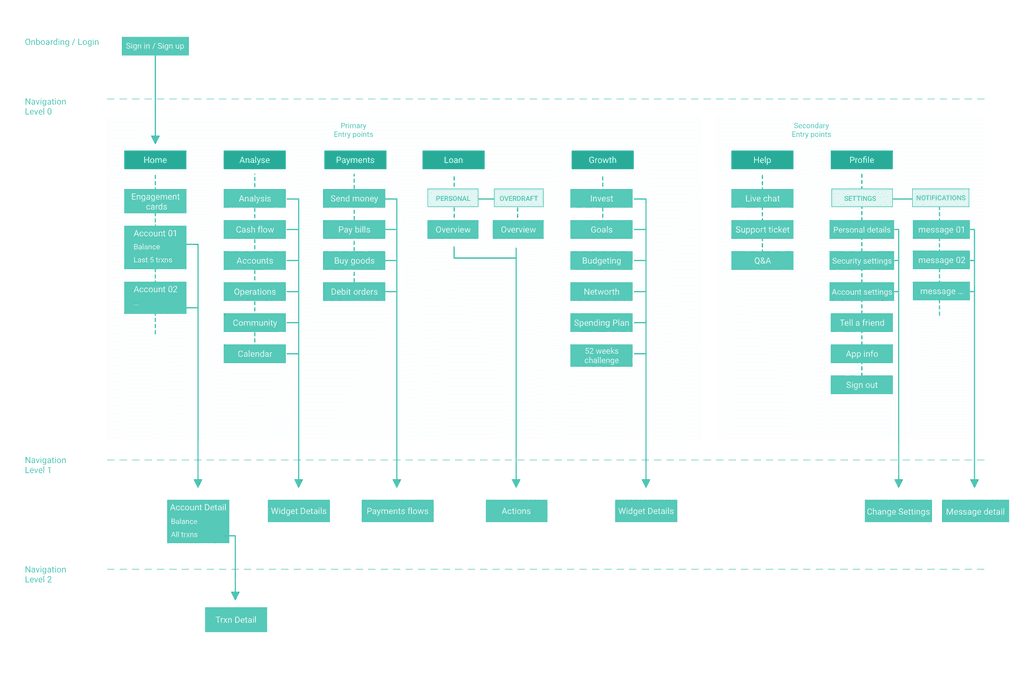
Information Architecture
UI Design
Design System
The Challenge
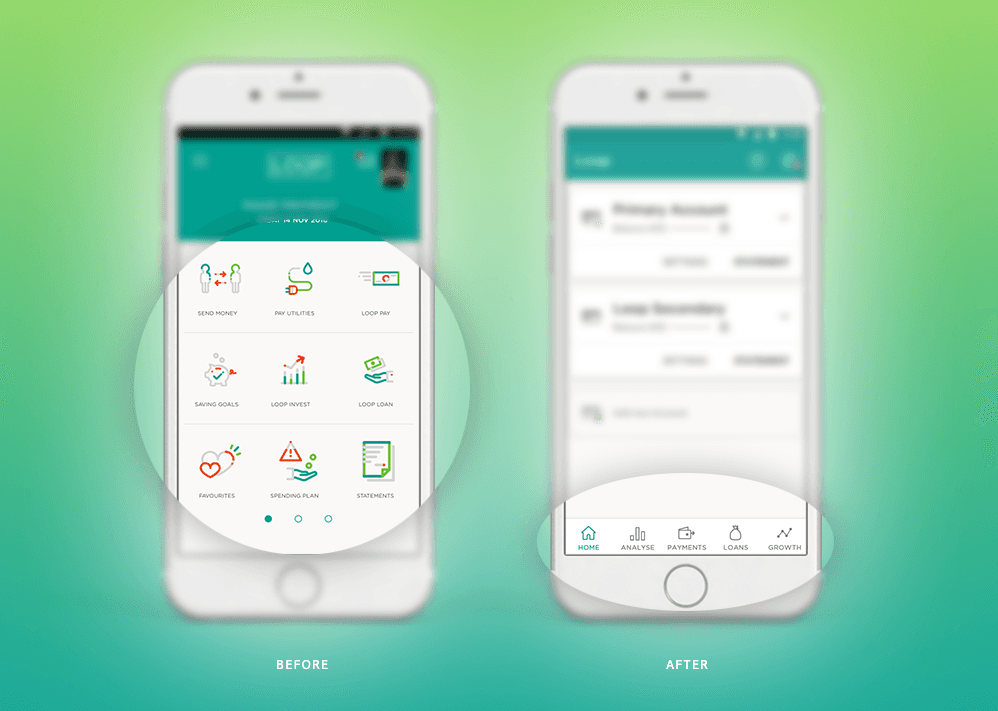
Rethinking Navigation
Loop offers 18 functionalities designed to help users manage their personal finances. Originally all of these options were displayed in form of individual tiles hiding behind a slider on the home screen. As this arrangement was far too complex and overwhelming for the user, we decided to divide the core-functionalities into five entry points, that were all within a thumbs reach.
Getting Personal
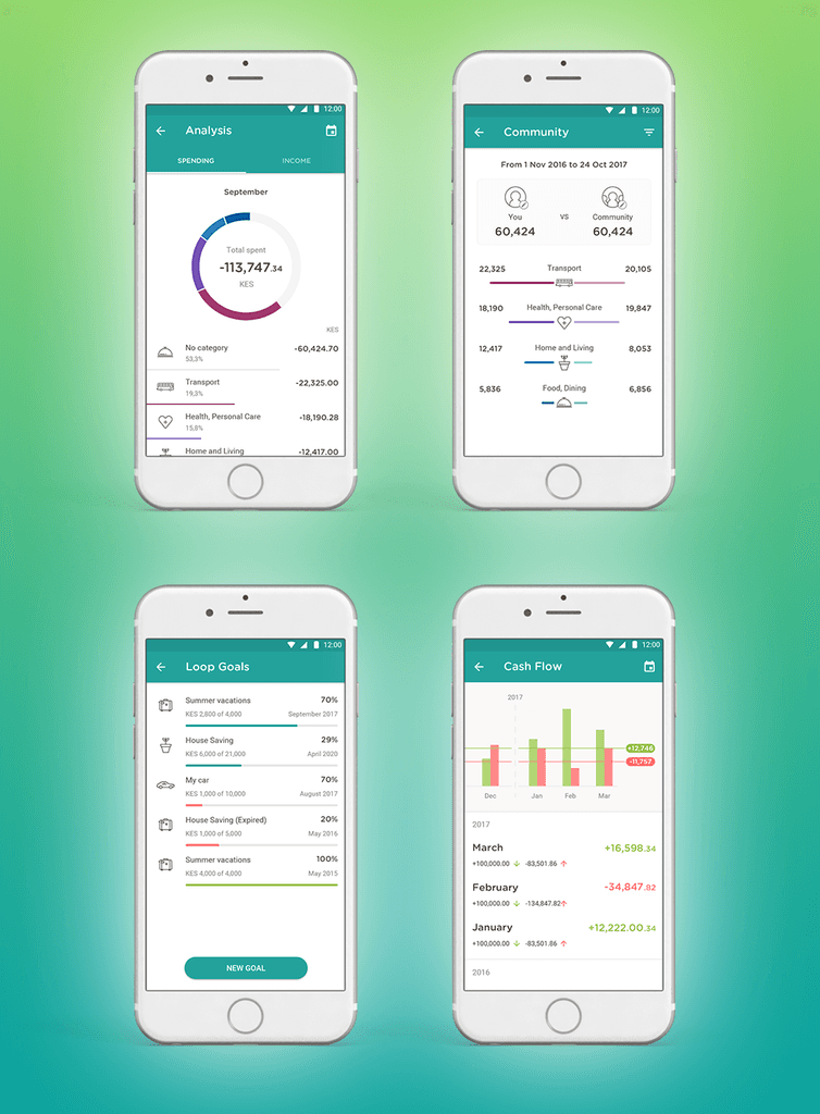
Unlike other banking apps which mainly allow customers to save, borrow, pay bills and buy goods and services, we also added a personal finance management tool that enables users to track, plan and analyse their income against their expenditure on a regular basis.
This comes in the form of several widgets that are designed to warn customers when they are living beyond their means or spending too much on consumption rather than investment, which is likely to come in hand for its target group – millennial entrepreneurs seeking to grow their start-ups and small businesses. The widgets enable the user to be more aware of and interpret data faster, check the cash-flow, invest, set personal goals and even take out loans.
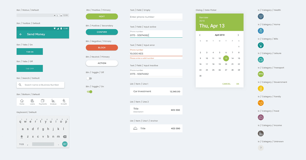
Design System
To comply with my NDAs, I have omitted confidential information. All information in this case study is my own and does not necessarily reflect the views of the client.
