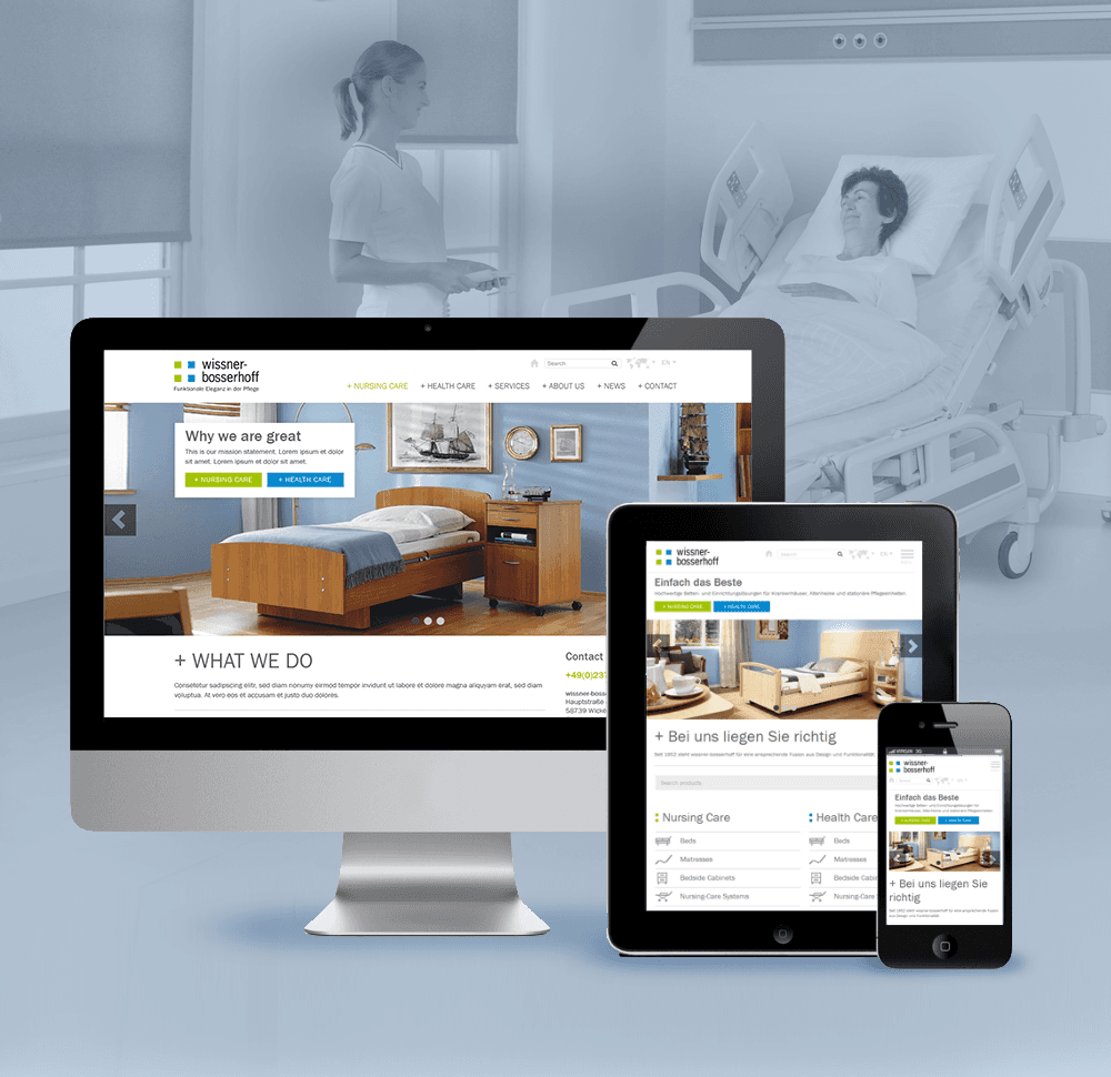
Wissner Bosserhoff is the leading provider of innovative, high quality bed and furniture solutions for hospitals, retirement homes and residential care establishments.
As the innovative market leader the company gives important creative impetus across all areas of this industry - their website however was an odd exception.
I facilitated a design thinking workshop for a leading global e-commerce retailer with 30 cross-functional participants to identify issues with their current software, ideate on solutions, and align on a shared vision for the future MVP.
Kickoff
After winning the client through a successful pitch (yay! 🥳) collaboration began to conduct the companies largest website relaunch to date. The main issues of the current website were it's confusing navigation, lack of relevant information and engagement opportunities, and non-responsiveness.
From the beginning I worked closely together with the clients multinational team from Germany and the Czech Republic. A one day workshop at the wi-bo premises served as the basis for all our future collaboration and enabled us to identify goals, current challenges and new ideas.
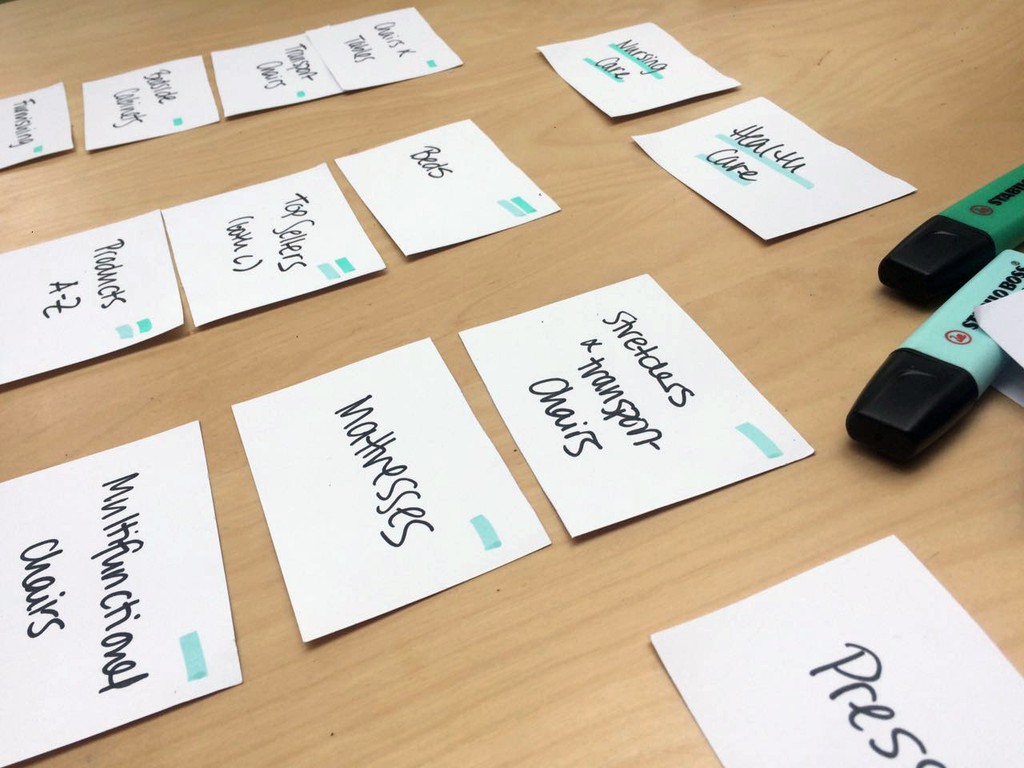
Well researched personas and a thorough content audit allowed us to evaluate what content we had and what content we needed to develop a relevant product. The additional card sorting exercise enabled us to categorize this content in a logical way and establish an intelligent sitemap and information architecture.
Ready for Execution
Armed with the knowledge from our workshop I created wireframes and a first interactive prototype. This prototype was revised and incorporated the feedback we gathered during various user tests eliminating risks and friction before it went into development.
We had identified our key users as being product buyers from hospitals and care homes so the highlight of the new website natually became the product page emphasizing the three key areas of information, innovation and interaction.
Design Thoughts
Since hospital and care home beds aren't the sexiest product, it was really important to not just highlight the bed itself, but sell the user an entire atmosphere around it to minimize its clinical nature. Hence the product page features a screen filling image of the product in its actual environment, drawing the user into a beautifully furnished room, to make the product more appealing.
The large amount of product details and technical features are presented in a compact, minimalistic style including a „convince-your-boss“ PDF to download and print. Other new features include a bookmark function and a sticky bar featuring previously viewed products, making it easier to navigate and compare products.


