Taxfix

Taxfix

Taxfix

Simplifying Taxes - Designing Taxfix's Pre-fill Mandate

Simplifying Taxes - Designing Taxfix's Pre-fill Mandate

Simplifying Taxes - Designing Taxfix's Pre-fill Mandate

About this project

About this project

About this project

In the ever-evolving landscape of financial technology, Taxfix stands out as a company committed to simplifying the complex world of tax preparation. The company offers an intuitive solution that helps everyone get the best possible refund, allowing you to file your tax return quickly and paperlessly from anywhere - via app or browser.

Tax offices house a diverse array of data from employers and insurance providers, which can seamlessly integrate into tax returns through automation. Identifying this as a valuable enhancement that would significantly elevate their service, Taxfix wanted to incorporate this functionality into their product.

TL;DR

TL;DR

TL;DR

Taxfix aimed to simplify tax filing through their app by automating data integration from tax offices through a new feature. I designed and tested this feature, collaborating with dev and content teams. The successful launch exceeded our goal of collecting PFMs from over 1% of users.

Deliverables

User Flows

Wireframes

UI Design

Prototype

User Testing

The Challenge

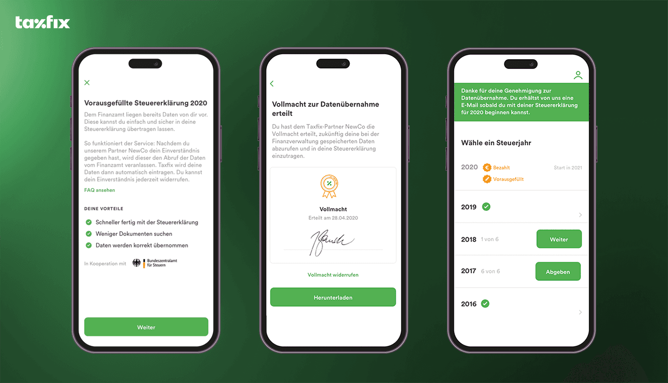
As part of the Growth team, I was tasked to design this new feature - called pre-fill mandate (PFM) - which would allow the user to automatically retrieve and add data directly from the tax offices to their tax return. In order to allow Taxfix to retrieve the pre-fill data, the company needed tax advisory credentials which can only be granted by permission from the user. The goal was to obtain a valid PFM from at least 1% of users submitting their taxes in the next quarter.

As part of the Growth team, I was tasked to design this new feature - called pre-fill mandate (PFM) - which would allow the user to automatically retrieve and add data directly from the tax offices to their tax return. In order to allow Taxfix to retrieve the pre-fill data, the company needed tax advisory credentials which can only be granted by permission from the user. The goal was to obtain a valid PFM from at least 1% of users submitting their taxes in the next quarter.

Establishing the Basics and First Sketches

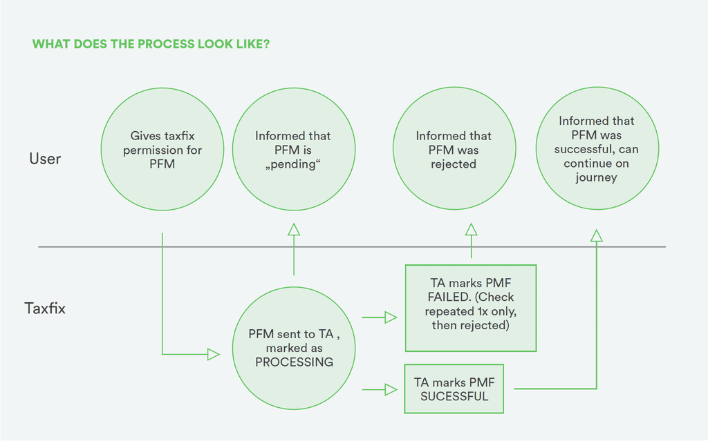
In a collaborative tech session with the dev team we defined what the general PFM process would look like - all the way from introducing the service to obtaining the user permission to communication with the tax office to informing the user that their data has been successfully retrieved and added to their submission form. We also defined what makes a PFM a successful/failure and what specific data we need from users to create a valid PFM. 

During this phase, I also delved into understanding what users we were building for and identifying their specific needs.

The main focus was on providing informative content that effectively communicated the essence of the feature and secondly provide persuasive information outlining the PFMs benefits in order to encourage users to give their consent. Here I worked closely together with the content team to make sure that the language was clear and simple. 

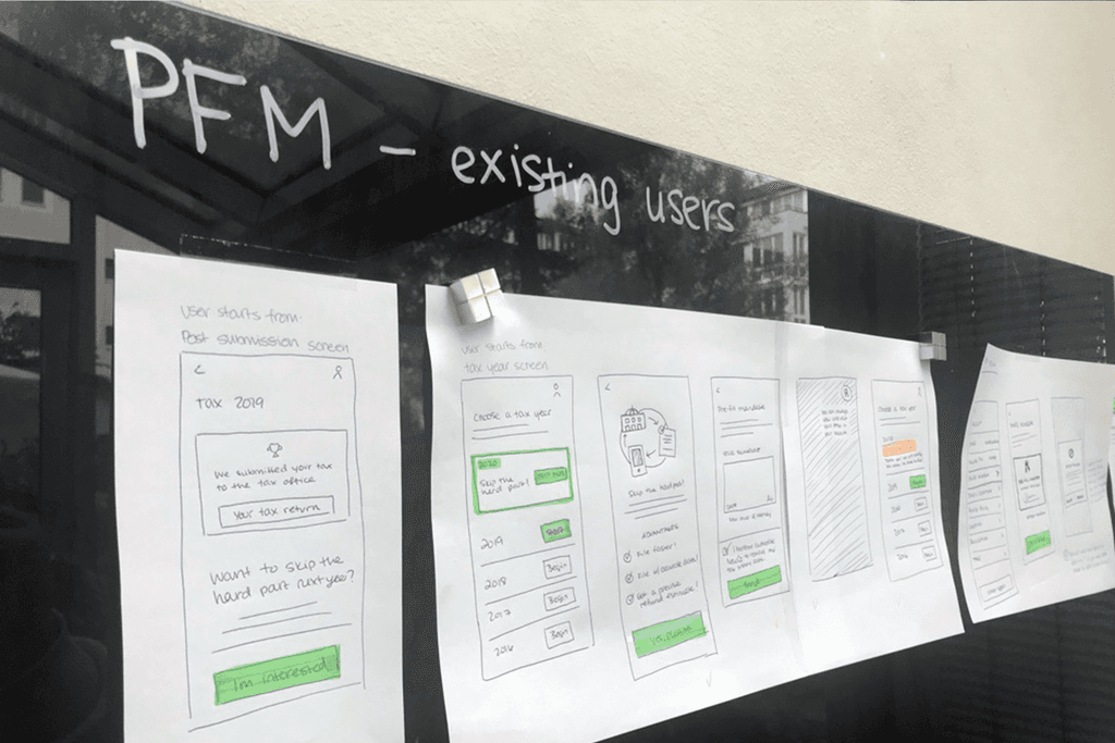
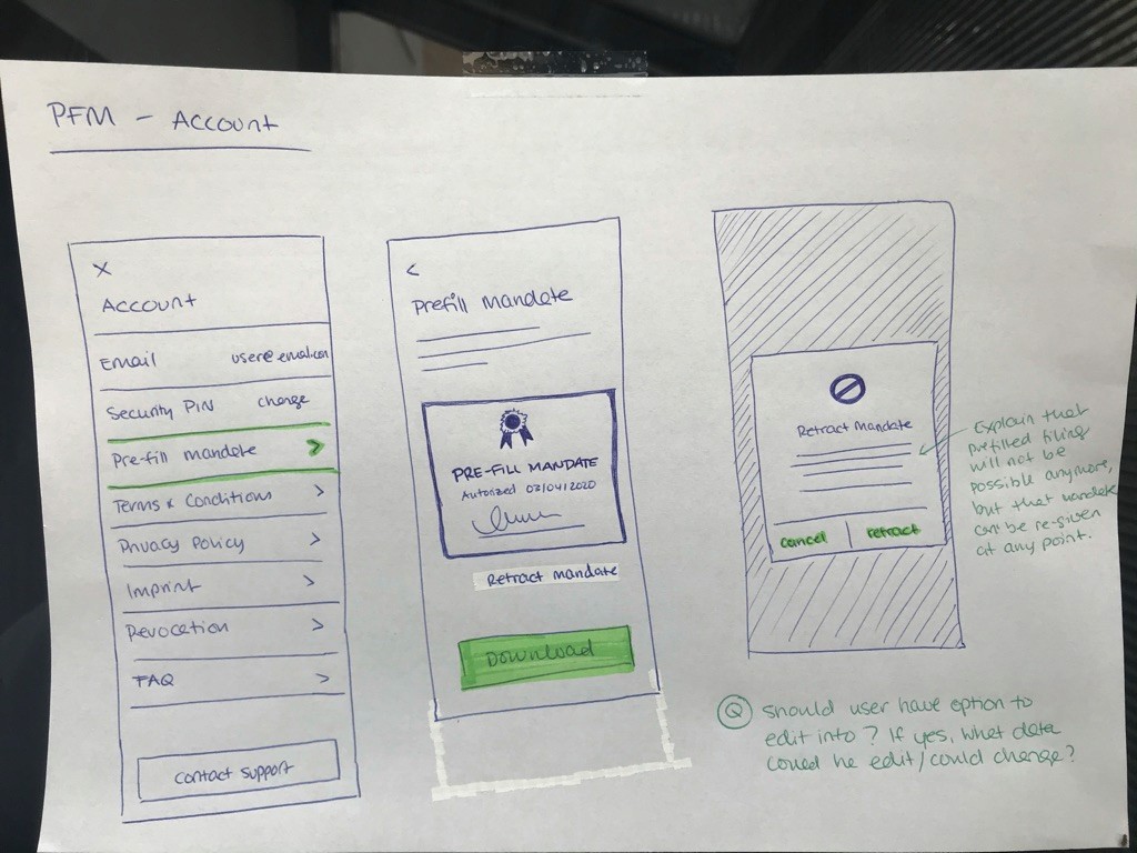
After mapping all of this out I made first sketches of what the feature could look like. I presented these ideas to the stakeholders, iterating on the concept after some feedback rounds. 

User testing

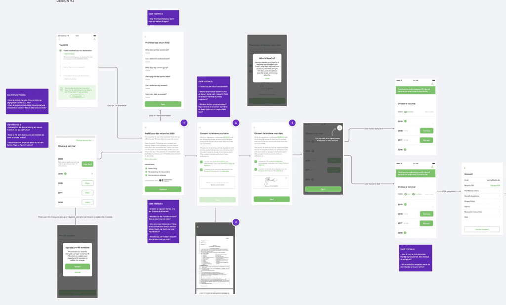
After finalization I used the sketches to created a prototype that I used as the basis for our user testing. Due to the complexity of the feature and content I opted for high fidelity.

We conducted unmoderated remote testing with five participants recruited via playbook.ux. Participants were selected based on criteria such as income, employment, and age. The testing protocol included a set of 15 open-ended questions, along with four Likert scales, allowing users to provide detailed feedback on their experience.

Our objective was to gather user feedback on four primary aspects: assess the willingness to use the pre-fill mandate feature, evaluate the ease of the design, gauge the understandability of our design, and identify any challenges or issues encountered with our design.

What I learned

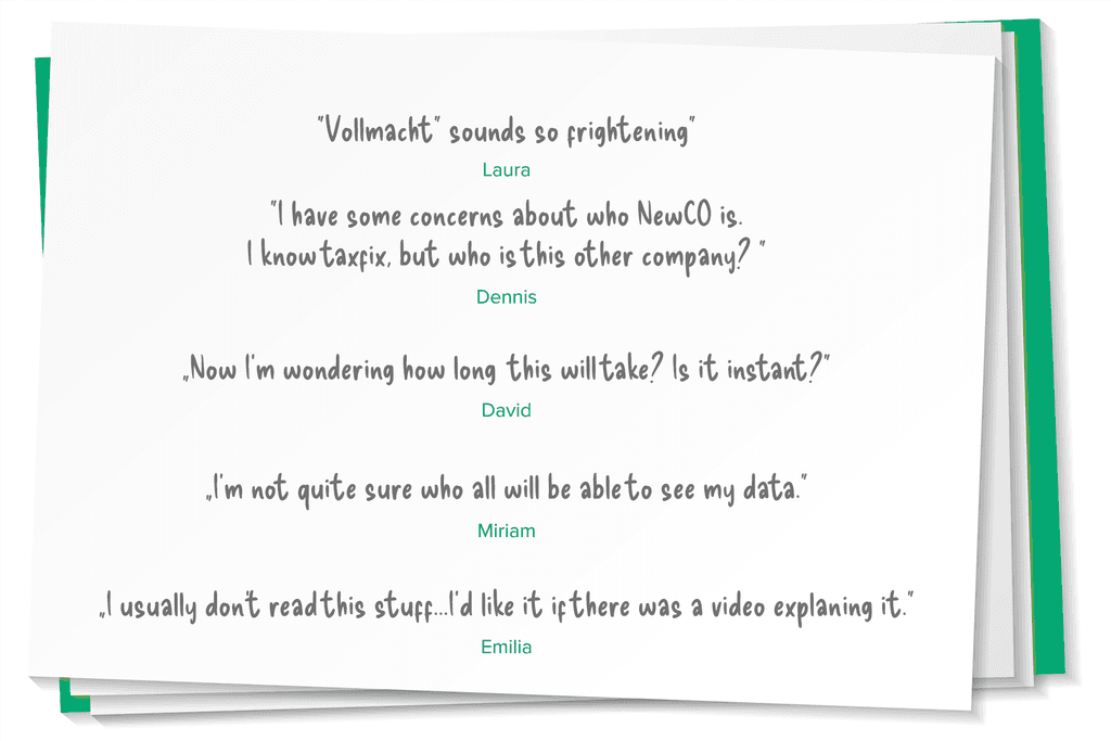
The responses revealed users expressing overall satisfaction but conveyed some specific desires for improvement. They wished for explanatory illustrations or videos to enhance understanding. Additionally, they suggested providing more detailed explanations for terms like "Vollmacht" and "Beiblatt” as well as more detailed information about any third-party involvement, a clearer indication of the process length, and more comprehensive details on data privacy.

This feedback allowed us to pinpoint the specific screens that required adjustments and tweaks to better align with the user needs and preferences.


The Impact

The Impact

The successful and timely launch of the feature exceeded our goal, with over 1% of users submitting valid PFMs in the first quarter. Users appreciated the seamless integration and the ability to file their taxes more efficiently, reflecting positively in user feedback and reviews. The launch also provided valuable insights into user behavior and preferences, guiding further improvements on other places in the app.

The successful and timely launch of the feature exceeded our goal, with over 1% of users submitting valid PFMs in the first quarter. Users appreciated the seamless integration and the ability to file their taxes more efficiently, reflecting positively in user feedback and reviews. The launch also provided valuable insights into user behavior and preferences, guiding further improvements on other places in the app.

To comply with my NDAs, I have omitted confidential information. All information in this case study is my own and does not necessarily reflect the views of the client.

Bildnachweis: mockup.store auf Freepik
https://de.freepik.com/freie-psd/hand-haelt-neues-smartphone-modell-umgeben-von-blaettern_10818190.htm
Dominique Irby

Senior UX/UI Designer

dominique@dominiqueirby.com

Dominique Irby

Senior UX/UI Designer

dominique@dominiqueirby.com

Dominique Irby

Senior UX/UI Designer

dominique@dominiqueirby.com