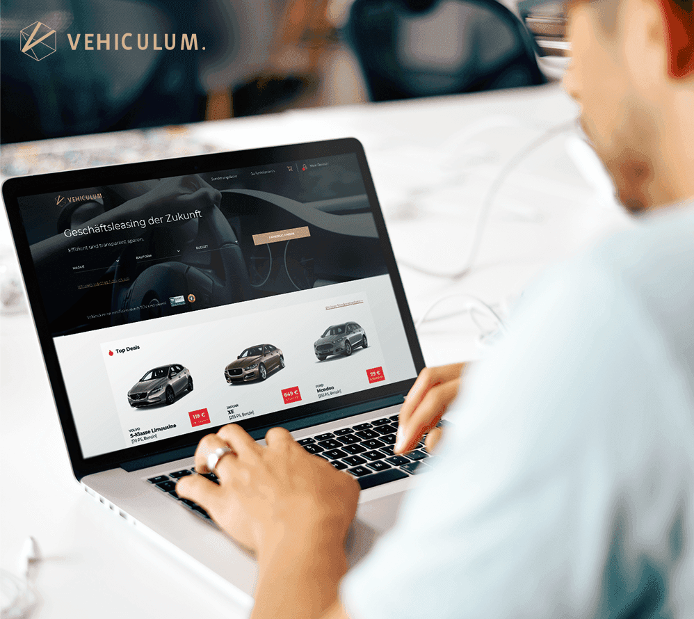
Vehiculum believes in leasing and digital transformation as the No. 1 mobility solution for the future. The online platform offers users real-time price comparison as well as simple contract management supporting companies with small carfleets.
But struggling to scale alongside the growth of the company resulted in a host of disparate features that made the experience slow and complex to use.
Vehiculum, an online leasing platform, faced usability issues that hindered user experience and conversion rates. I redesigned key areas, including the home page, product list, product tiles, and mobile interface. By reducing clicks, grouping similar car models, and improving mobile navigation, the platform became faster and more intuitive. The result was a more engaging and efficient platform that increased user satisfaction and conversion rates.
Deliverables
UX Audit
Information Architecture
UI Design
Prototype
User Testing
The Challenge
The Research
Before jumping into designing, it was important to identify current pain points of the existing platform. My main sources for quality feedback were in-depth interviews with our heavy users and the sales team. Qualitative research was important to me at this point because first-hand information about how the users interacted with our platform and where they struggled exposed problems that even the most detailed questionnaire never would.
I identified four areas where users experienced severe usability issues:
1. The home page
2. The product list page
3. The product tiles
4. the mobile experience
The Homepage
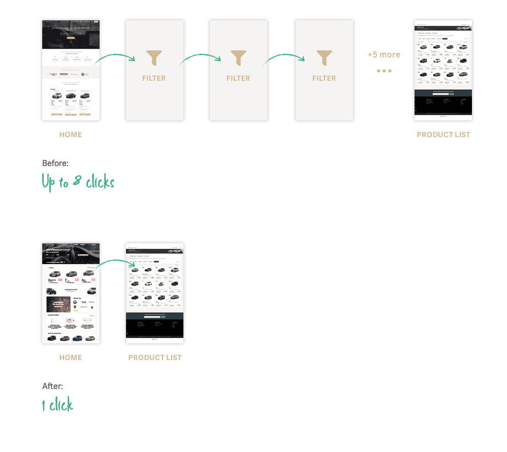
The main problem with the home page was that the content displayed was mostly irrelevant. There was only one point of entry and the user was forced to complete a very complex filtering process, involving up to eight clicks until they were able to see the actual product.
By reworking the entry into the funnel and the funnel concept itself, I was able to reduce the amount of clicks the user needed to get to the products from eight to one.
The Product List and Tiles
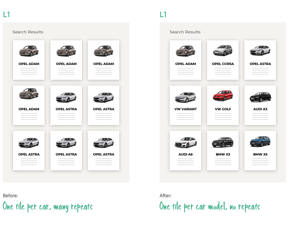
On the product list page (L1) users were facing many problems. The most severe ones were: A) the same cars were being displayed multiple times and B) there was too much irrelevant information displayed on the individual car tiles. In order to solve these problems the information architecture and the way the products were displayed had to be fundamentally changed.
The status quo was that each car had its own tile and a unique URL. Because some cars only had minor technical differences f.e. in horsepower or type of engine, this resulted in the "same" car showing up in search results multiple times and sometimes with different prices, without the user being able to tell why. In order to solve this problem I restructured the way the cars were displayed by grouping all cars of the same model into one tile.
By grouping car models into one tile I solved the issue of repeating tiles, reduced the overall volume of search results significantly and made browsing the platform more enjoyable and efficient.
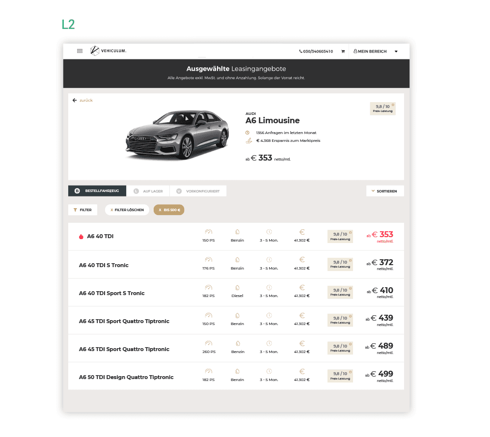
When the user clicks on a tile he is redirected to the model list page (L2). Here he can see all cars available for this model. I researched what information would be the most useful to the user in order to make an informed choice between cars, and displayed these prominently in a list style. This made it much easier to compare several cars of the same models.
Mobile
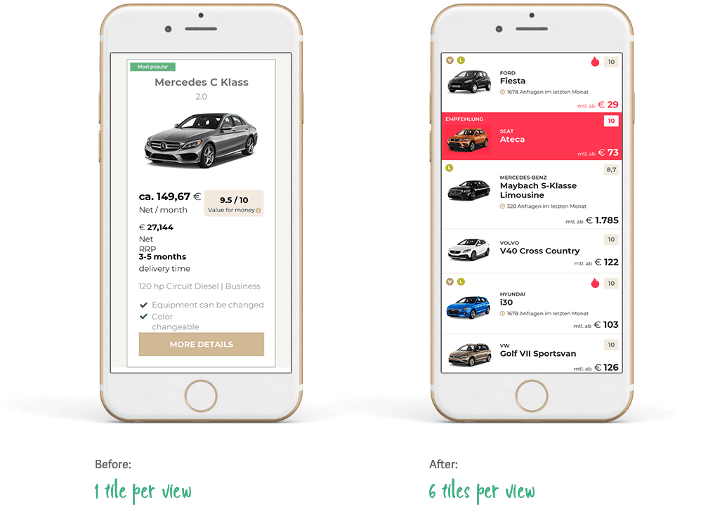
For the mobile version of the platform I switched from tiles to a list. Previously the user was only able to see one tile per view, which made scrolling through search results tiresome. With the new design the user can now see at least six cars at once making scrolling through the platform much more engaging.
To comply with my NDAs, I have omitted confidential information. All information in this case study is my own and does not necessarily reflect the views of the client.
